Clone the Reciprocal Tariffs Table Using Plotnine

python
polars
plotnine
Author

Jerry Wu

Published

April 16, 2025

This post presents a recreated visualization using Polars and plotnine, based on my earlier work.

Below is the final figure: Cloned Reciprocal Tariffs Table

Show full code
import polars as pl
from matplotlib.figure import Figure
from plotnine import (
    aes,
    element_blank,
    element_rect,
    element_text,
    geom_segment,
    geom_text,
    ggplot,
    position_nudge,
    scale_color_identity,
    scale_size_identity,
    scale_y_discrete,
    theme,
    theme_void,
    watermark,
)


# source1: https://truthsocial.com/@realDonaldTrump/114270398531479278
# source2:
# "https://upload.wikimedia.org/wikipedia/commons/
# thumb/3/36/Seal_of_the_President_of_the_United_States.svg/
# 800px-Seal_of_the_President_of_the_United_States.svg.png"
logo_filename = "logo_resized.png"
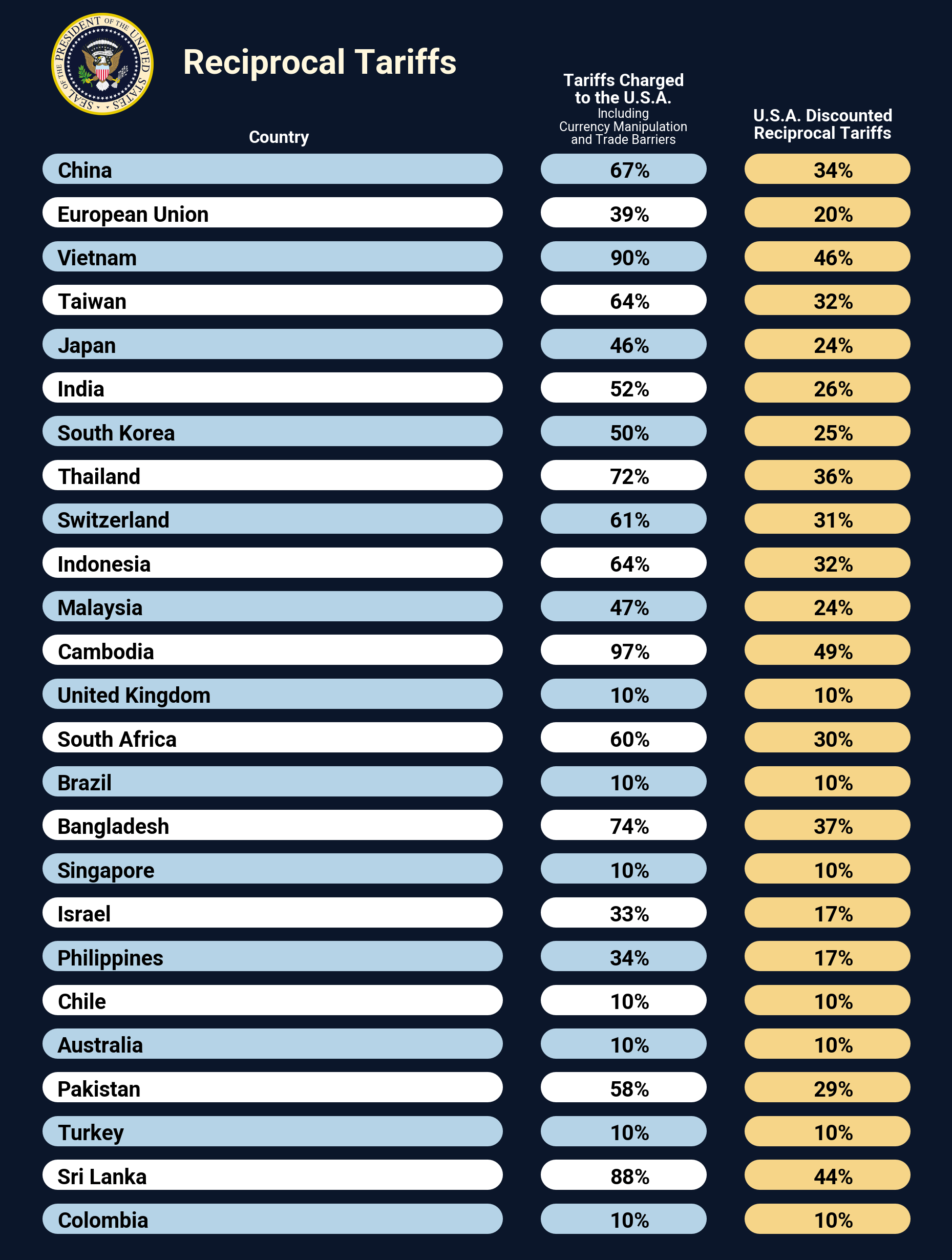
data = {
    "country": [
        "China",
        "European Union",
        "Vietnam",
        "Taiwan",
        "Japan",
        "India",
        "South Korea",
        "Thailand",
        "Switzerland",
        "Indonesia",
        "Malaysia",
        "Cambodia",
        "United Kingdom",
        "South Africa",
        "Brazil",
        "Bangladesh",
        "Singapore",
        "Israel",
        "Philippines",
        "Chile",
        "Australia",
        "Pakistan",
        "Turkey",
        "Sri Lanka",
        "Colombia",
    ],
    "tariffs_charged": [
        "67%",
        "39%",
        "90%",
        "64%",
        "46%",
        "52%",
        "50%",
        "72%",
        "61%",
        "64%",
        "47%",
        "97%",
        "10%",
        "60%",
        "10%",
        "74%",
        "10%",
        "33%",
        "34%",
        "10%",
        "10%",
        "58%",
        "10%",
        "88%",
        "10%",
    ],
    "reciprocal_tariffs": [
        "34%",
        "20%",
        "46%",
        "32%",
        "24%",
        "26%",
        "25%",
        "36%",
        "31%",
        "32%",
        "24%",
        "49%",
        "10%",
        "30%",
        "10%",
        "37%",
        "10%",
        "17%",
        "17%",
        "10%",
        "10%",
        "29%",
        "10%",
        "44%",
        "10%",
    ],
}

country, tariffs_charged, reciprocal_tariffs = data.keys()

dark_navy_blue = "#0B162A"  # background
light_blue = "#B5D3E7"  # row
white = "#FFFFFF"  # row
yellow = "#F6D588"  # "reciprocal_tariffs" column
gold = "#FFF8DE"  # logo

fontname_georgia = "Georgia"  # title
fontname_roboto = "Roboto"  # body


def tweak_df() -> pl.DataFrame:
    # column width
    x_col1_start, x_col1_end = 5, 52.5
    x_col2_start, x_col2_end = 60, 75
    x_col3_start, x_col3_end = 82.5, 97.5

    # x-position for body text
    x_col1_text = 5
    x_col2_text = x_col2_start + (x_col2_end - x_col2_start) / 3 + 1
    x_col3_text = x_col3_start + (x_col3_end - x_col3_start) / 3 + 1

    return (
        pl.DataFrame(data)
        .with_row_index()
        .with_columns(
            pl.col(country).cast(pl.Categorical),
            pl.when(pl.col("index").mod(2).eq(0))
            .then(pl.lit(light_blue))
            .otherwise(pl.lit(white))
            .alias("color_mod"),
            pl.lit(x_col1_start).alias("x_col1_start"),
            pl.lit(x_col1_end).alias("x_col1_end"),
            pl.lit(x_col2_start).alias("x_col2_start"),
            pl.lit(x_col2_end).alias("x_col2_end"),
            pl.lit(x_col3_start).alias("x_col3_start"),
            pl.lit(x_col3_end).alias("x_col3_end"),
            pl.lit(x_col1_text).alias("x_col1_text"),
            pl.lit(x_col2_text).alias("x_col2_text"),
            pl.lit(x_col3_text).alias("x_col3_text"),
        )
    )


def get_textdata_df(x_ref: float = 0.0, y_ref: float = 0.0) -> pl.DataFrame:
    title_fontsize = 16
    title_fontweight = "bold"
    heading_fontsize = 8
    heading_fontweight = "bold"
    subheading_fontsize = 6
    subheading_fontweight = "normal"

    textdata_df = pl.DataFrame(
        {
            "label": [
                "Reciprocal Tariffs",  # title
                "Country",  # col1
                "Tariffs Charged",  # col2
                "to the U.S.A.",
                "Including",
                "Currency Manipulation",
                "and Trade Barriers",
                "U.S.A. Discounted",  # col3
                "Reciprocal Tariffs",
            ],
            "x": [
                x_ref + 34.0,
                x_ref + 29.5,
                x_ref + 67.5,
                x_ref + 67.5,
                x_ref + 67.5,
                x_ref + 67.5,
                x_ref + 67.5,
                x_ref + 89.5,
                x_ref + 89.5,
            ],
            "y": [
                y_ref + 27,
                y_ref + 25.5,
                y_ref + 26.8,
                y_ref + 26.4,
                y_ref + 26.1,
                y_ref + 25.8,
                y_ref + 25.5,
                y_ref + 26.0,
                y_ref + 25.6,
            ],
            "color": [
                gold,
                white,
                white,
                white,
                white,
                white,
                white,
                white,
                white,
            ],
            "fontsize": [
                title_fontsize,
                heading_fontsize,
                heading_fontsize,
                heading_fontsize,
                subheading_fontsize,
                subheading_fontsize,
                subheading_fontsize,
                heading_fontsize,
                heading_fontsize,
            ],
            "fontweight": [
                title_fontweight,
                heading_fontweight,
                heading_fontweight,
                heading_fontweight,
                subheading_fontweight,
                subheading_fontweight,
                subheading_fontweight,
                heading_fontweight,
                heading_fontweight,
            ],
            "fontname": [
                fontname_georgia,
                fontname_georgia,
                fontname_georgia,
                fontname_georgia,
                fontname_georgia,
                fontname_georgia,
                fontname_georgia,
                fontname_georgia,
                fontname_georgia,
            ],
        }
    )
    return textdata_df


def plot_g() -> ggplot:
    geom_segment_props = {"size": 8, "lineend": "round"}

    geom_text_props = {
        "ha": "left",
        "va": "center",
        "position": position_nudge(y=-0.08),
        "size": 10,
        "fontweight": "bold",
    }

    return (
        ggplot(data=df, mapping=aes(y=country, yend=country))
        # col1 segment
        + geom_segment(
            mapping=aes(x="x_col1_start", xend="x_col1_end", color="color_mod"),
            **geom_segment_props,
        )
        # col2 segment
        + geom_segment(
            mapping=aes(x="x_col2_start", xend="x_col2_end", color="color_mod"),
            **geom_segment_props,
        )
        # col3 segment
        + geom_segment(
            mapping=aes(x="x_col3_start", xend="x_col3_end"),
            color=yellow,
            **geom_segment_props,
        )
        # col1 text
        + geom_text(aes(x="x_col1_text", label=country), **geom_text_props)
        # col2 text
        + geom_text(aes(x="x_col2_text", label=tariffs_charged), **geom_text_props)
        # col3 text
        + geom_text(aes(x="x_col3_text", label=reciprocal_tariffs), **geom_text_props)
        # using "color_mod" column directly
        + scale_color_identity()
        # expand extra space
        + scale_y_discrete(
            limits=df.select(country).reverse().to_series().to_list(),
            expand=(0.02, 0, 0, 1.5),
        )
        # title and headers
        + geom_text(
            data=textdata_df,
            mapping=aes(
                x="x",
                y="y",
                label="label",
                color="color",
                size="fontsize",
                fontweight="fontweight",
                fontname="fontname",
            ),
            va="bottom",
            ha="center",
        )
        # using "size" column directly
        + scale_size_identity()
        # logo
        + watermark(logo_filename, 100, 2235)
    )


def themify(p: ggplot) -> Figure:
    return (
        p
        + theme_void()
        + theme(
            legend_position="none",  # turns off the legend
            axis_text_x=element_blank(),
            axis_text_y=element_blank(),
            axis_title_x=element_blank(),
            axis_title_y=element_blank(),
            panel_background=element_rect(fill=dark_navy_blue),
            plot_background=element_rect(fill=dark_navy_blue),
            text=element_text(family=fontname_roboto),
            dpi=300,
            figure_size=(6, 8),
        )
    ).draw(False)


df = tweak_df()
textdata_df = get_textdata_df()
p = plot_g()
fig = themify(p)
fig

Preparing the DataFrames

Main DataFrame

We start by extracting the data from a previous project. The country column is converted to a categorical type, which simplifies handling in plotnine. To enable alternating row colors in the final visualization, we also create a new column called color_mod. Additional columns are created to define the positions for the segments and text labels.

def tweak_df() -> pl.DataFrame:
    # column width
    x_col1_start, x_col1_end = 5, 52.5
    x_col2_start, x_col2_end = 60, 75
    x_col3_start, x_col3_end = 82.5, 97.5

    # x-position for body text
    x_col1_text = 5
    x_col2_text = x_col2_start + (x_col2_end - x_col2_start) / 3 + 1
    x_col3_text = x_col3_start + (x_col3_end - x_col3_start) / 3 + 1

    return (
        pl.DataFrame(data)
        .with_row_index()
        .with_columns(
            pl.col(country).cast(pl.Categorical),
            pl.when(pl.col("index").mod(2).eq(0))
            .then(pl.lit(light_blue))
            .otherwise(pl.lit(white))
            .alias("color_mod"),
            pl.lit(x_col1_start).alias("x_col1_start"),
            pl.lit(x_col1_end).alias("x_col1_end"),
            pl.lit(x_col2_start).alias("x_col2_start"),
            pl.lit(x_col2_end).alias("x_col2_end"),
            pl.lit(x_col3_start).alias("x_col3_start"),
            pl.lit(x_col3_end).alias("x_col3_end"),
            pl.lit(x_col1_text).alias("x_col1_text"),
            pl.lit(x_col2_text).alias("x_col2_text"),
            pl.lit(x_col3_text).alias("x_col3_text"),
        )
    )

df = tweak_df()

Textdata DataFrame

Next, we create another DataFrame that contains information for all the text elements, such as text color, font size, and font weight, for the title and headers.

def get_textdata_df(
    x_ref: float = 0.0, y_ref: float = 0.0
) -> pl.DataFrame:
    title_fontsize = 16
    title_fontweight = "bold"
    heading_fontsize = 8
    heading_fontweight = "bold"
    subheading_fontsize = 6
    subheading_fontweight = "normal"

    textdata_df = pl.DataFrame(
        {
            "label": [
                "Reciprocal Tariffs",  # title
                "Country",  # col1
                "Tariffs Charged",  # col2
                "to the U.S.A.",
                "Including",
                "Currency Manipulation",
                "and Trade Barriers",
                "U.S.A. Discounted",  # col3
                "Reciprocal Tariffs",
            ],
            "x": [
                x_ref + 34.0,
                x_ref + 29.5,
                x_ref + 67.5,
                x_ref + 67.5,
                x_ref + 67.5,
                x_ref + 67.5,
                x_ref + 67.5,
                x_ref + 89.5,
                x_ref + 89.5,
            ],
            "y": [
                y_ref + 27,
                y_ref + 25.5,
                y_ref + 26.8,
                y_ref + 26.4,
                y_ref + 26.1,
                y_ref + 25.8,
                y_ref + 25.5,
                y_ref + 26.0,
                y_ref + 25.6,
            ],
            "color": [
                gold,
                white,
                white,
                white,
                white,
                white,
                white,
                white,
                white,
            ],
            "fontsize": [
                title_fontsize,
                heading_fontsize,
                heading_fontsize,
                heading_fontsize,
                subheading_fontsize,
                subheading_fontsize,
                subheading_fontsize,
                heading_fontsize,
                heading_fontsize,
            ],
            "fontweight": [
                title_fontweight,
                heading_fontweight,
                heading_fontweight,
                heading_fontweight,
                subheading_fontweight,
                subheading_fontweight,
                subheading_fontweight,
                heading_fontweight,
                heading_fontweight,
            ],
            "fontname": [
                fontname_georgia,
                fontname_georgia,
                fontname_georgia,
                fontname_georgia,
                fontname_georgia,
                fontname_georgia,
                fontname_georgia,
                fontname_georgia,
                fontname_georgia,
            ],
        }
    )
    return textdata_df

textdata_df = get_textdata_df()

Constructing the ggplot Object

With the processed DataFrame ready, we can now build the ggplot() object:

def plot_g() -> ggplot:
    geom_segment_props = {"size": 8, "lineend": "round"}

    geom_text_props = {
        "ha": "left",
        "va": "center",
        "position": position_nudge(y=-0.08),
        "size": 10,
        "fontweight": "bold",
    }

    return (
        ggplot(data=df, mapping=aes(y=country, yend=country))
        # col1 segment
        + geom_segment(
            mapping=aes(x="x_col1_start", xend="x_col1_end", color="color_mod"),
            **geom_segment_props,
        )
        # col2 segment
        + geom_segment(
            mapping=aes(x="x_col2_start", xend="x_col2_end", color="color_mod"),
            **geom_segment_props,
        )
        # col3 segment
        + geom_segment(
            mapping=aes(x="x_col3_start", xend="x_col3_end"),
            color=yellow,
            **geom_segment_props,
        )
        # col1 text
        + geom_text(aes(x="x_col1_text", label=country), **geom_text_props)
        # col2 text
        + geom_text(aes(x="x_col2_text", label=tariffs_charged), **geom_text_props)
        # col3 text
        + geom_text(aes(x="x_col3_text", label=reciprocal_tariffs), **geom_text_props)
        # using "color_mod" column directly
        + scale_color_identity()
        # expand extra space
        + scale_y_discrete(
            limits=df.select(country).reverse().to_series().to_list(),
            expand=(0.02, 0, 0, 1.5),
        )
        # title and headers
        + geom_text(
1            data=textdata_df,
            mapping=aes(
                x="x",
                y="y",
                label="label",
                color="color",
                size="fontsize",
                fontweight="fontweight",
                fontname="fontname",
            ),
            va="bottom",
            ha="center",
        )
        # using "size" column directly
        + scale_size_identity()
        # logo
        + watermark(logo_filename, 100, 2235)
    )
1
The data= argument is set to textdata_df, which contains all the custom label and styling details for the title and column headers.

What’s happening here?

  1. geom_segment(): Since I couldn’t find a way to apply border radius, I used geom_segment() with lineend="round" as the best available workaround. Thick lines serve as cell backgrounds.
  2. geom_text(): Adds text for each column.
  3. scale_color_identity(): Uses the color values directly from the color_mod column, without applying a scale.
  4. scale_y_discrete(): Reorders the country axis and tweaks padding to add space above and below the table.
  5. scale_size_identity(): Similar to color scaling, this instructs plotnine to use the font sizes specified in the fontsize column without transformation.
  6. watermark(): Embeds a logo. Since there’s no native figure size parameter in plotnine, I manually scaled the output.

Custom Theme

We apply a tailored theme with themify() to refine the figure’s appearance:

def themify(p: ggplot) -> Figure:
    return (
        p
        + theme_void()
        + theme(
            legend_position="none",  # turns off the legend
            axis_text_x=element_blank(),
            axis_text_y=element_blank(),
            axis_title_x=element_blank(),
            axis_title_y=element_blank(),
            panel_background=element_rect(fill=dark_navy_blue),
            plot_background=element_rect(fill=dark_navy_blue),
            text=element_text(family=fontname_roboto),
            dpi=300,
            figure_size=(6, 8),
        )
    ).draw(False)

Final Rendering

Now, let’s tie it all together:

p = plot_g()
fig = themify(p)
fig

Closing Thoughts

This post showcases how plotnine can be used to create table-like visualizations. I’m genuinely impressed by its capabilities — it’s surprisingly fun to approach a table as a figure.

Throughout this exploration, I learned a lot from this repository, which won the Plotnine Contest 2024. It’s a fantastic example of what’s possible with the library.

It would be exciting to explore how plotnine and Great Tables might work together to enable even richer visual storytelling — I’m looking forward to diving into that next.

Disclaimer
  1. This table is intended as a self-practice project, and the data in the table may not be 100% accurate. Please refer to the original source if you require verified data.
  2. This post was drafted by me, with AI assistance to refine the content.